Afrovibes Africa
Afrovibes Africa was refining its positioning as a premier curator of community-powered, intimate African experiences. For years, they have been a platform for immersive, high-energy expression, celebrating African creativity across music, food, dance, storytelling, and fashion. As part of the MetaCraft team, I contributed to the development and execution of the refreshed Afrovibes Africa visual identity. My role covered design of a logo system for Afrovibes Africa and its eight sub-brands, development of colour system & graphic elements, as well as key visual design for subsequent event marketing.

The logo
I led the redesign of the Afrovibes Africa logo as part of MetaCraft’s wider rebrand process. The main ideas behind the logo were rhythm, community, and the propagation of energy (sound). This led to several explorations that featured repetition, waves, interconnected lines, and a strong focus on custom typography.
The final logo distilled all of this into a mark that was iconic as much as typographic (the name of the brand needed to be kept front and centre). Compared to the previous logo, it was more dynamic, and had encoded the rhythm and energy of African art and entertainment.


Sub-brand architecture
Following the master logo design, designs were developed for the eight sub-brands of Afrovibes Africa (Community Fest was a slightly separate project).
The logos for Afrovibes Live and Afrovibes Fest simply replaced "Africa"; then the typography style was extended to create custom wordmarks for Àló, Abula Festival, GIG House, Indie Night Live, and Sing Along Tour. The result was a group of brand logos that could be identified as one family.

The visual system
The typeface P22 Arts and Crafts had been used previously by the MetaCraft team for creating event visuals for Afrovibes Africa, and having a unique mixture of boldness and personality, it was a good fit as far as evolving the brand. As a second typeface, the team decided on Sequel 100 Black—its range of weights made it a great, easily-readable typeface to complement P22.
The new colour system enabled the brand produce a wide range of moods and emotions, featuring hues from the primary logo, and expanding the palette into a spectrum of warm and cool colours.
Considering the logo does not contain a symbolic element, I created an emblem inspired by forms from the Afrovibes logo (the A and V shapes, as well as the dot and dash pattern surrounding the logo). Pushing the visual identity even further, I developed a pair of vector brush-stroke elements that denote the personal, human focus of the brand. The interplay of all these elements created a foundation on which to build layouts and designs for future event communications.


Event campaign visuals
I led the design execution of key visuals for the following event rollouts within MetaCraft’s creative direction, incorporating input from the studio team.
Cavy People (with The Cavemen) - 2025
Àló: A Folk Music Experience - 2025 (direction inspired strongly by work done by MetaCraft for a previous edition of the event)
Afrovibes Africa x Jameson Distillery on Tour - 2025
Black Culture Rave - 2025
Although each of these events had a different art direction, the typography, colour and the texture language helped the team ensure new promotional material was grounded in the visual identity.


Other applications
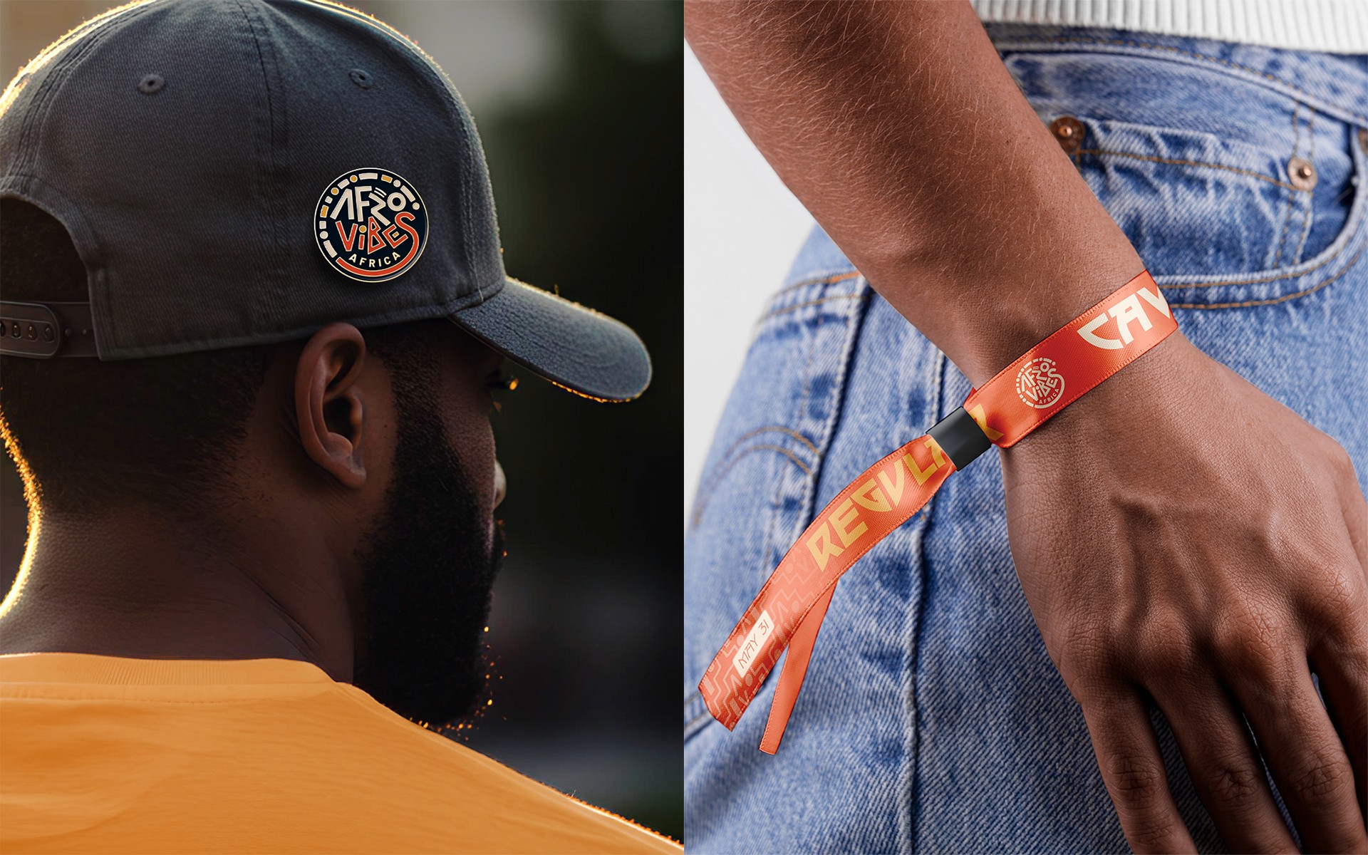
Applications across event installations, merchandise, and access credentials, created by the team to explore and showcase the visual identity.


" height="1030.8321196687893px" id="bIx5uTCz_" transform="translate(0 589.857)" width="2279.88132271574px"/><path d="M 212.903 1566.492 C 189.224 1613.16 145.429 1616.608 109.221 1616.608 C 69.45 1616.608 -26.875 1607.987 7.149 1536.491 C 48.07 1448.901 279.227 989 382.909 782.671 C 486.706 576.342 597.284 350.472 644.527 121.613 C 660.735 43.795 682.575 0 783.498 0 C 884.306 0 891.777 54.83 911.433 121.613 C 942.009 226.56 1078.565 614.389 1228.456 845.547 C 1592.606 1407.98 1818.017 1569.365 1818.017 1719.83 C 1818.017 1754.429 1792.613 1764.2 1684.909 1764.2 C 1577.089 1764.2 1582.836 1746.843 1544.214 1692.128 C 1390.301 1476.029 1316.045 1412.578 1054.312 1279.47 C 797.866 1148.661 464.751 1084.636 384.058 1072.566 C 303.366 1060.497 404.289 931.987 404.289 931.987 C 404.289 931.987 1165.005 1114.062 1280.297 1210.272 C 1288.343 1217.284 1287.193 1227.629 1277.998 1231.652 C 1266.388 1237.4 1126.383 1117.51 974.769 849.57 C 888.768 697.613 815.155 538.971 754.646 375.186 L 804.763 417.256 C 804.763 417.256 256.123 1481.201 212.903 1566.492" fill="rgb(18, 18, 18)" height="1764.1996493999995px" id="BuObkLO_H" transform="translate(153.665 0)" width="1818.0166452783405px"/><path d="M 948.669 147.105 C 425.892 147.105 317.613 126.99 97.95 68.137 C 28.867 49.746 0.015 117.679 0.015 159.749 C 0.015 195.498 -2.858 260.098 70.363 271.018 C 487.044 333.319 686.476 333.319 988.441 320.56 C 1663.867 291.708 1928.473 141.933 2025.258 224.924 C 2107.1 295.271 2042.5 870.924 2042.5 937.823 C 2042.5 982.767 2080.548 1009.894 2152.045 1009.894 C 2212.506 1009.894 2267.911 986.79 2267.911 941.271 C 2267.911 941.271 2308.832 150.554 2196.414 38.136 C 2067.904 -90.374 1487.539 147.105 948.669 147.105" fill="rgb(18, 18, 18)" height="1009.8940897137527px" id="BeWBFnLk_" transform="translate(5343.164 610.795)" width="2275.173928666788px"/><path d="M 212.903 1566.492 C 189.224 1613.16 145.429 1616.608 109.221 1616.608 C 69.45 1616.608 -26.875 1607.987 7.149 1536.491 C 48.07 1448.901 279.227 989 382.909 782.671 C 486.706 576.342 597.284 350.472 644.527 121.613 C 660.735 43.795 682.575 0 783.498 0 C 884.306 0 891.777 54.83 911.433 121.613 C 942.009 226.56 1078.565 614.389 1228.456 845.547 C 1592.606 1407.98 1818.017 1569.365 1818.017 1719.83 C 1818.017 1754.429 1792.613 1764.2 1684.909 1764.2 C 1577.089 1764.2 1582.836 1746.843 1544.214 1692.128 C 1390.301 1476.029 1316.045 1412.578 1054.312 1279.47 C 797.866 1148.661 464.751 1084.636 384.058 1072.566 C 303.366 1060.497 404.289 931.987 404.289 931.987 C 404.289 931.987 1165.005 1114.062 1280.297 1210.272 C 1288.343 1217.284 1287.193 1227.629 1277.998 1231.652 C 1266.388 1237.4 1126.383 1117.51 974.769 849.57 C 888.768 697.613 815.155 538.971 754.646 375.186 L 804.763 417.256 C 804.763 417.256 256.698 1481.201 212.903 1566.492" fill="rgb(18, 18, 18)" height="1764.1996493999995px" id="sGRtM1VXo" transform="translate(5506.047 0)" width="1818.016645278341px"/><path d="M 1250.752 105.521 C 1250.752 214.49 1243.855 1404.532 1243.855 1404.532 C 1243.855 1481.201 1205.808 1489.248 1109.023 1489.248 C 982.812 1489.248 963.156 1449.476 933.73 1391.888 C 700.388 936.01 379.342 576.342 19.1 194.834 C -30.442 142.419 27.836 81.842 64.619 50.806 C 92.896 27.127 183.358 -29.886 223.705 19.656 C 223.705 19.656 1057.067 1095.096 1057.067 1192.456 C 1057.067 1208.663 1032.354 1199.352 1032.354 1199.352 C 1032.354 653.011 1024.307 396.566 1002.353 104.946 C 997.18 33.449 1048.446 0 1129.139 0 C 1179.255 0 1251.327 7.012 1251.327 106.096" fill="rgb(18, 18, 18)" height="1489.2475018000005px" id="ftDbarfpJ" transform="translate(1992.285 137.132)" width="1251.3268534066033px"/><path d="M 249.249 103.107 C 247.524 188.972 235.455 491.511 234.88 785.43 C 234.306 1055.784 244.651 1317.977 240.053 1405.566 C 238.903 1452.35 244.076 1490.282 109.244 1490.282 C 3.148 1490.282 -3.174 1463.27 0.849 1407.291 C 26.827 1054.635 14.068 403.347 9.47 110.004 C 8.321 17.242 67.173 0 145.567 0 C 195.684 0 250.398 18.391 248.674 103.682" fill="rgb(18, 18, 18)" height="1490.2820207500008px" id="p0HLRSBkp" transform="translate(4311.857 136.672)" width="249.24862671991315px"/><path d="M 25.146 73.313 C 33.193 -26.346 273.546 -22.323 262.626 72.738 C 154.231 1013.346 257.453 1245.538 520.796 1245.538 C 784.139 1245.538 900.005 1039.783 895.407 655.402 C 894.257 579.308 981.272 870.352 981.272 870.352 C 981.272 870.352 1003.801 1487.041 509.301 1487.041 C 14.801 1487.041 -48.074 987.943 25.721 73.313" fill="rgb(18, 18, 18)" height="1487.0405048902458px" id="YwSZ2R22_" transform="translate(3433.438 136.499)" width="981.4290030704155px"/><path d="M 227.139 1434.533 C 203.46 1481.201 170.126 1484.075 95.755 1484.075 C 16.787 1484.075 -13.214 1451.775 5.292 1407.98 C 81.962 1222.457 434.043 303.804 475.539 98.049 C 493.355 10.46 556.806 0 629.452 0 C 701.983 0 747.617 24.254 770.032 103.797 C 859.345 424.268 1187.862 1024.174 1348.098 1433.958 C 1359.018 1461.66 1314.648 1492.696 1221.312 1492.696 C 1138.32 1492.696 1113.492 1474.304 1093.951 1439.706 C 850.149 1016.702 508.413 954.976 423.123 910.607 C 351.051 873.134 416.801 737.152 463.469 756.233 C 676.695 843.823 1089.353 1035.094 1171.77 1160.73 C 1290.51 1341.196 970.039 1134.293 966.59 1125.097 C 783.825 668.644 591.979 269.78 591.979 269.78 L 632.326 280.125 C 632.326 280.125 271.508 1348.093 227.714 1433.383" fill="rgb(18, 18, 18)" height="1492.6958983000004px" id="gCUpVJcQe" transform="translate(8591.897 134.832)" width="1349.7214788284828px"/><path d="M 249.21 71.498 C 249.21 180.467 255.532 1005.094 271.165 1412.005 C 274.038 1477.754 205.415 1490.973 131.62 1490.973 C 58.973 1490.973 -4.362 1479.478 0.236 1412.005 C 28.513 1038.543 18.627 363.692 3.109 71.498 C -0.339 11.611 70.583 0.001 120.7 0.001 C 170.816 0.001 248.635 -1.148 248.635 71.498" fill="rgb(18, 18, 18)" height="1490.972781635212px" id="gLhDJD4N_" transform="translate(10928.748 136.003)" width="271.2519072416835px"/><path d="M 54.146 0 C 54.146 0 413.239 18.391 532.439 18.391 C 651.753 18.391 1016.594 0 1016.594 0 C 1069.584 0 1064.986 124.487 1064.986 124.487 C 1064.986 179.202 1066.71 222.422 1013.72 222.422 C 1013.72 222.422 650.604 212.651 529.565 212.651 C 408.641 212.651 51.273 222.422 51.273 222.422 C -1.718 222.422 0.006 173.454 0.006 118.74 C 0.006 118.74 1.156 0.575 54.146 0.575" fill="rgb(18, 18, 18)" height="222.42157425000005px" id="TwyL50feG" transform="translate(9722.177 136.04)" width="1065.0867630788625px"/><path d="M 140.266 1380.278 C 67.62 1380.278 -4.911 1368.784 0.261 1301.31 C 27.848 935.32 33.596 299.666 12.905 0 L 257.282 0 C 256.707 133.683 239.35 982.563 279.122 1301.31 C 287.283 1367.059 213.487 1380.278 139.691 1380.278" fill="rgb(18, 18, 18)" height="1380.2781723999997px" id="vq8pyDZxK" transform="translate(10114.98 246.721)" width="279.7415406831824px"/><path d="M 22.523 201.166 C 32.293 191.97 373.454 -145.168 593.117 73.805 C 779.791 260.478 526.218 688.769 526.218 688.769 C 526.218 688.769 451.848 693.367 464.607 684.171 C 591.393 594.168 1091.641 594.168 1091.641 1035.678 C 1091.641 1449.485 541.851 1550.983 370.006 1550.983 C 329.66 1550.983 285.865 1514.66 285.865 1442.014 C 285.865 1394.771 287.589 1298.446 371.156 1298.446 C 677.833 1298.446 897.381 1228.213 869.679 1029.93 C 838.643 806.359 534.839 884.638 403.456 951.537 C 362.535 972.342 284.716 945.79 248.393 904.294 C 201.724 851.878 209.311 810.382 236.898 753.254 C 313.567 595.432 517.023 335.998 399.432 248.984 C 296.9 173.464 159.079 353.355 144.711 365.424 C 107.238 397.15 54.248 337.148 32.868 315.308 C 11.603 293.928 -22.996 243.811 21.948 200.591" fill="rgb(18, 18, 18)" height="1550.9831043542245px" id="bGvqf20Y_" transform="translate(7488.824 106.041)" width="1091.6405261338987px"/></g></svg>)